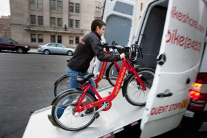
Predicting which stations will be empty or full

As I mentioned on my previous post about Bike sharing Rebalancing a key question that I am trying to answer in my research is which stations of the system will be under unstable conditions, such as empty or full, for example.

To be more accurate, I am not only interested on empty or full stations, rather the exact number of bikes that each station will have in any given time of the day. Under some circumstances it is desirable to have an empty or a full station to allocate the upcoming demand pattern.

Can we anticipate when a station is going to be unstable?

The answer is yes and to do so we can use Machine Learning techniques.

Machine learning is a good fit to tackle this sort of predictive problem. Machine learning techniques explore and learn from data to build a model that can then be used as a decision making tool or to make predictions given some inputs.

In this particular problem I tested the following techniques: 1) Gradient Boosting Machines, 2) Random Forests, 3) Neural Networks and 4) Linear Regression.

The best model turn out to be Gradient Boosting Machines (GBM). GBM repeatedly fit a simple classifier, a decision tree in most of the cases, to a subset of the data, both in terms of the number of observations and the number of attributes used explain the outcome.  Finally, it aggregates, or makes an ensemble of all the simpler model predictions to make a final decision.

In the current problem, the outcome is the expected number of bikes in a given station and time of day and the attributes are past bike observations in that station and the surrounding ones, and weather data such as the temperature. Selecting the right attributes or features is key to achieve good performance and some of the machine learning techniques are more or less sensitive to irrelevant attributes. Below you can see the attributes that I used.
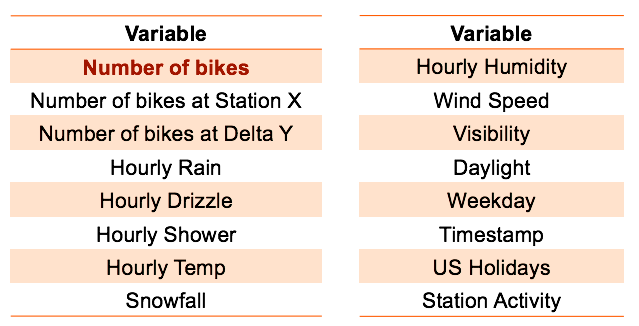
Variables
List of attributes


The predictions are made at 20, 40 and 60 min from the current time using data from The Hubway bikes haring system in Boston. For every station we fit a single GBM model using 3 months of historical and weather data and we test it on the last 15 days.  Below we show the mean attribute importance plot aggregated over all the stations. Note, that as expected, the most important attribute is the hour of the day followed by the station activity, measured as the standard deviation of the past 6 observations.
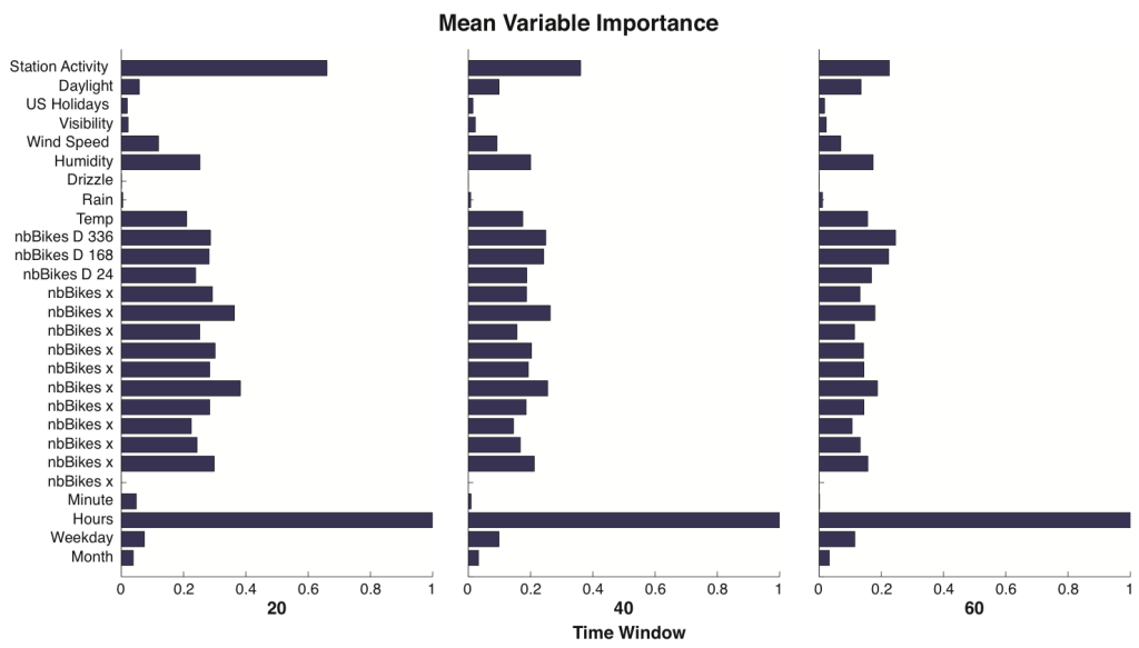
outcomes
Mean Attribute Importance over all stations (61)


Why is it important to make predictions?

Being able to make predictions is important because:

  • The operator can make better informed decisions
  • It reduces the overall repositioning costs
  • It increases the system performance and user satisfaction
  • We move from a reactive approach to a proactive approach
  • From a mathematical perspective, we can reduce the complexity of the problem allowing for real time decision making
  • It has the potential to modify riders behavior in advanced and allow for rider-based rebalancing policies (eg. suggesting a rider to get a bike from another station well in advance)

The predictions are the building block of the comprehensive framework to model the rebalancing operations of a bike sharing system that I propose.
 

About Bike Sharing Rebalancing

Bike sharing is a sustainable and environmentally friendly transportation mode that offers bikes ‘‘on-demand’’ to improve daily urban mobility. However, although bikesharing systems potentially offer a viable alternative for enhancing urban mobility, they suffer from the effects of fluctuating spatial and temporal demand. In other words,  the number of bikes and docks available in any given station heavily depends on its location and the time of day, this dynamics introduce inefficiencies in the system, such as having empty or full stations for long periods of time.

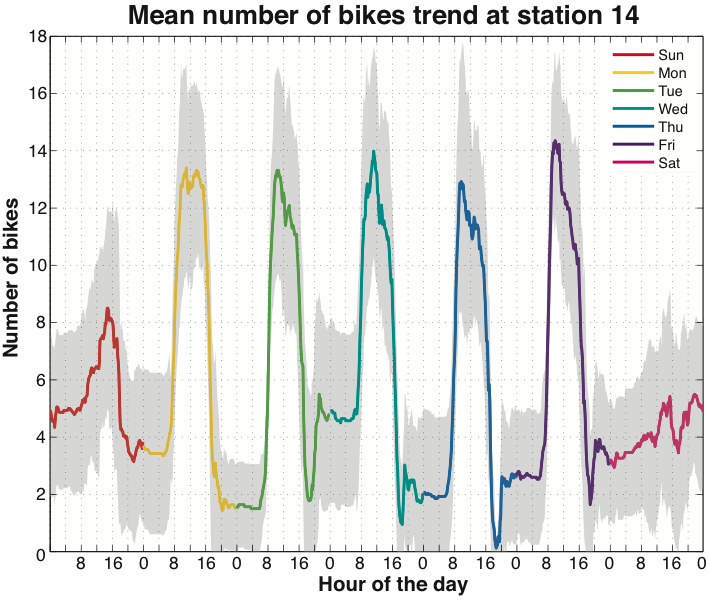
station_dynamicsFor example, in this plot we can see the mean number of bikes  for different days of the week and times of day over a period of 3 months.  Note how the demand patterns are different on weekdays and weekends and that during the day there is a sudden increase on arrivals at around 8AM and departures at 16 PM.

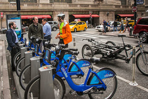
The issue of this demand pattern is that during a day, some stations will be empty and some will be full, degrading the level of service.  Furthermore, there is a cascade effect, where when a station becomes full, the nearby stations will also get full quickly, as riders that arrive to the full station are looking for docks to park their bikes. As a result, bike sharing operators are forced to “rebalance” the system by repositioning bikes in real time, and they usually do so by loading and unloading bikes to a fleet of vans that travel around the city. In New York City, due to congestion, it is more efficient to do it by using a rickshaw-like trailer.

Jesse Winter - http://www.news.cornell.edu/stories/2015/01/cornell-research-steers-nyc-bikes-needy-stations
Jesse Winter
Darrow Montgomery
Darrow Montgomery

You may wonder if this also occurs in other vehicle sharing systems, such as car sharing, for example. The simple answer is that it only occurs on systems where one-way trips are allowed, meaning that you can pick a vehicle in one station and drop it to another.

Most of car sharing systems do not allow for one-way trips. Look at ZipCar for example. Well, after all, repositioning a bike is much easier than repositioning a vehicle, but, what will happen if the autonomous vehicle becomes mainstream?

Efficiently solving the bike sharing rebalancing problem has been my main research focus. To solve it, you need to answer the 3 following questions:

  • Which stations will be empty or full?
  • How many bikes do we need to add or remove?
  • Which is the optimal route of the repositioning vehicle?

So, how do you put together a website and a mobile App?

I discovered the potential of the Bluetooth technology on a Transportation Data Analysis class back in early 2011. We were monitoring traffic flows by pinging Bluetooth devices on vehicles and measuring travel times, speeds and Origin-Destination patterns.

Around the concept of Bluetooth a lot of ideas came to my mind, but they all shared something: they all needed a website and a mobile App.

With a group of friends we decided to pursue an idea, to make it happen, and we started Kaleri.

So, how do you put together a website and a mobile App? This is what we refer to as our “starter kit“:

  • The backend: Django. A python based web framework. “The web framework for perfectionists with deadlines”. We knew python, so we went ahead with it. It has great documentation and a lot of support. There are also a lot of packages or Django Apps that are great (django-tastypie, south,…).
  • The front end: Bootstrap and jquery. Bootstrap is a great resource to make your website look nice in seconds. Be careful though, as I have the feeling that all startup websites look the same. jquery is a javascript (.js) library that helps you make the website “dynamic” with great animations an effects.
  • The database: we use MySQL, but the good thing about Django is that it is database agnostic. In theory, we could easily switch to any other database (non-relational too) without having to change much code.
  • The Mobile App: we used PhoneGap for the iOS. The reasoning is that if you have learned HTML,CSS and js from putting together a website, you can re-use those skills and wrap up a great looking mobile App using PhoneGap. There are also great frameworks out there that mimic the feel of Android and iOS (framework7, AngularJS, ionicframework).

What I have learnt is that, even though you may have no idea how to start, it is just a matter of trying and wanting to learn new things. It takes time, but the answers are out there, Google and Stackoverflow become your friends and eventually, you will figure it out.

Good luck!

Data Visualization Tools

I am going to start updating a post that I wrote for my old blog almost 2 years ago. However, I still think is relevant today.

A more and more common word /concept out there is BIG DATA. I was listening today to a techcrunch video about the book Big data: A revolution that Will Transform How We Live, Work and Think and I decided to write this post. Big data is out there, but what we really need are tools to visualize, analyze and find hidden patterns.

I found this post really interesting, summarizing key visualization tools. However, there are some more out there than I think are useful too.

Plot.ly: it is a great concept to publish your work easily and make your plots interactive. It hooks up to MATLAB, Python or R and automatically generates a .js version of the plot, so you can share it on the web. I have not used it, but

cartoDB: great resource if you want to visualize data on a map.

Enigma: collects publicly available datasets and allows you to merge, select and play with them. You have to pay…

Quandl: similar idea as Engima but is open source. It has plotting and basic computational capabilities to play with the data.

Google Charts, Public Data and Maps Engine: Google has visualization tools available for free, that can be embedded into your website. However, in some cases you need programming skills to upload the data. Plots are interactive and easy to play with. The easiest tool is the new Google Maps Engine.

Wolfram Alpha: sort of search engine with computational, visualization and data analytics tools available. Can solve PDE, ODE and plot nice 3D plots.

ManyEyes: is a research project from IBM. Is the most complete and accessible tool one can play with without any prior knowledge. Anyone can upload their data set and select different visualization options. It also allows for different types of text analytics.

Statpedia: is the the collaborative search engine for statistics. In short, is like a Wikipedia, but for graphical content. One can create, search and share graphics easily. If generated through Statpedia creator, graphics are interactive and are displayed beautifully in search display boxes.